Bedding colour combinations: bedroom inspiration
A bedding brand's video demonstrates mixing patterns and colours on a bed. It covers bedding colours, not wall paint or evidence that a particular shade improves sleep.
By Brooklinen · Video language: English
On this article, the player loads when the page opens, without autoplay, unless you chose to block external content. Player privacy information
Open the video on YouTube (in a new tab)
The video illustrates this topic. The full article remains available without watching; captions and transcripts depend on the publisher and YouTube.
Start with the features you are keeping
Look at the color of the walls, floor, headboard and curtains. Choose a base shade for bedding that goes with at least one of them. It is not necessary to match each item to the exact same color.
For example, next to wood in a warm tone, you can try cream with olive green; Next to gray you can try white with blue. These are design examples, and your preference is a key part of the decision.
Give the dominant color a defined place
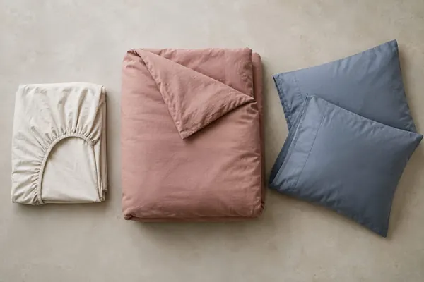
If you like red, mustard or orange, you can put them in pillowcases or a folded cover. This way it is easy to change the look without changing all the linens. Those who prefer a room rich in color can also choose a large duvet cover in a striking shade.
Instead of adding several competing prints, try one print next to a plain fabric. Check how they look together on the bed, and not just when they are folded in the store.
For more information on the subject: A cozy winter bedroom: light, color and bedding.
Check the color in the home lighting
Daylight and evening lighting can change how a shade appears. Sateen’s sheen and percale’s matte surface also affect the result. Online photographs do not guarantee an exact colour match.
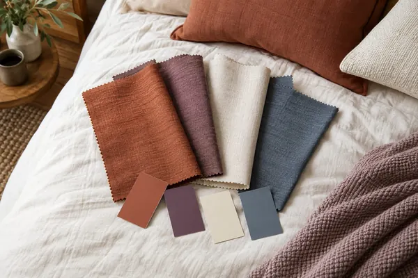
If a precise colour match matters, ask for a fabric swatch or check return options before buying. Keep the specification for reference, but compare the actual fabric under your room’s lighting where possible.
Choose a design that you can live with
Think about where decorative pillows are placed while sleeping and how to wash each part. Bedding that requires separation into three different washes may be less convenient for your routine.
There is no color that guarantees falling asleep or sleeping. It is possible to create a room that is pleasant for you to see and use, without attributing a medical effect to a particular shade. Start with one change and see if you like the result.
A simple method for choosing a leading color
Take a photo of the room in daylight and look at the things that are not going to change: floor, closet, walls and headboard. Choose one color that already blends in with them, then decide if the bedding will repeat it or be its background. In a room with a carpet and a prominent pattern, a smooth duvet cover may make the connection easier. In a mostly uniform room, you can give the bedding print more space.
You should place a fabric sample near the head of the bed and not hold it alone against another wall. The same gray may look different next to warm wood or next to cold white. Taking a picture on the phone helps to remember the combination, but is not a substitute for looking with the eye: the screen, the exposure and the lighting can change the tone obtained in the picture.
How to choose a print that will remain pleasant even on a daily basis?
Check the print when the fabric is unfolded and also when it is folded. A large pattern may look different when the quilt is folded in half or when pillows cover part of it. If there is a clear direction for the painting, think about whether you want to follow the direction in the entire arrangement of the bed. Pillowcases with a different pattern on each side can give two options without buying another set.
Before adding another colour, try changing just the pillowcases. They are a relatively small, easy-to-compare change. If two people use the room, each can choose from an agreed palette. There is no need to decide which colour is healthiest; aim for a look you both enjoy and can easily maintain.
A practical comparison before choosing
| room condition | Option to combine | Inspection before purchase |
|---|---|---|
| A prominent headboard | Smooth bedding as a background | The shade by the head of the bed |
| A room in solid colors | Print or leading color | View when the duvet cover is folded |
| Sunlight and evening lighting are different | Fabric sample at home | Test in both lights |
| Two different tastes | A small shared colour palette | Combining pillowcases without clutter |
Frequently asked questions
Do you have to match the sheet to the duvet cover?
Not exactly the same shade. You can choose a deliberate combination from the colors that already appear in the room or in the print.
How do I choose a bedding colour online?
Check the name of the shade, additional photos and the possibility of getting a sample. Keep in mind that the color on the screen is not a guarantee of an exact match.
Is there a bedding color recommended for everyone to sleep in?
There is no basis here to determine such a universal color. Choose according to personal preference and the room, and separate design from treatment of sleeping difficulties.
Sources and scope
Source check: September 15, 2026. The information was checked against the sources listed here. The selection tips help you compare options; they are not based on hands-on product tests by MyViro.
By MyViro.
The content explains textile characteristics and is not the result of a product test in a laboratory. How we prepare our guides
Based on content from the MyViro archive, edited and revised in September 2026.
Illustrative photos on this page were created with AI.